Cape Catamarans
Editorial brand storytelling for a small-batch carbon-fiber yacht-tender maker.
An independent design study. Renn Williamson Studio is not currently engaged with Cape Catamarans.
The frame is simple: most yacht tenders are an afterthought — heavy, plastic, anonymous. This one isn’t, and the site has to read that way from the first scroll.
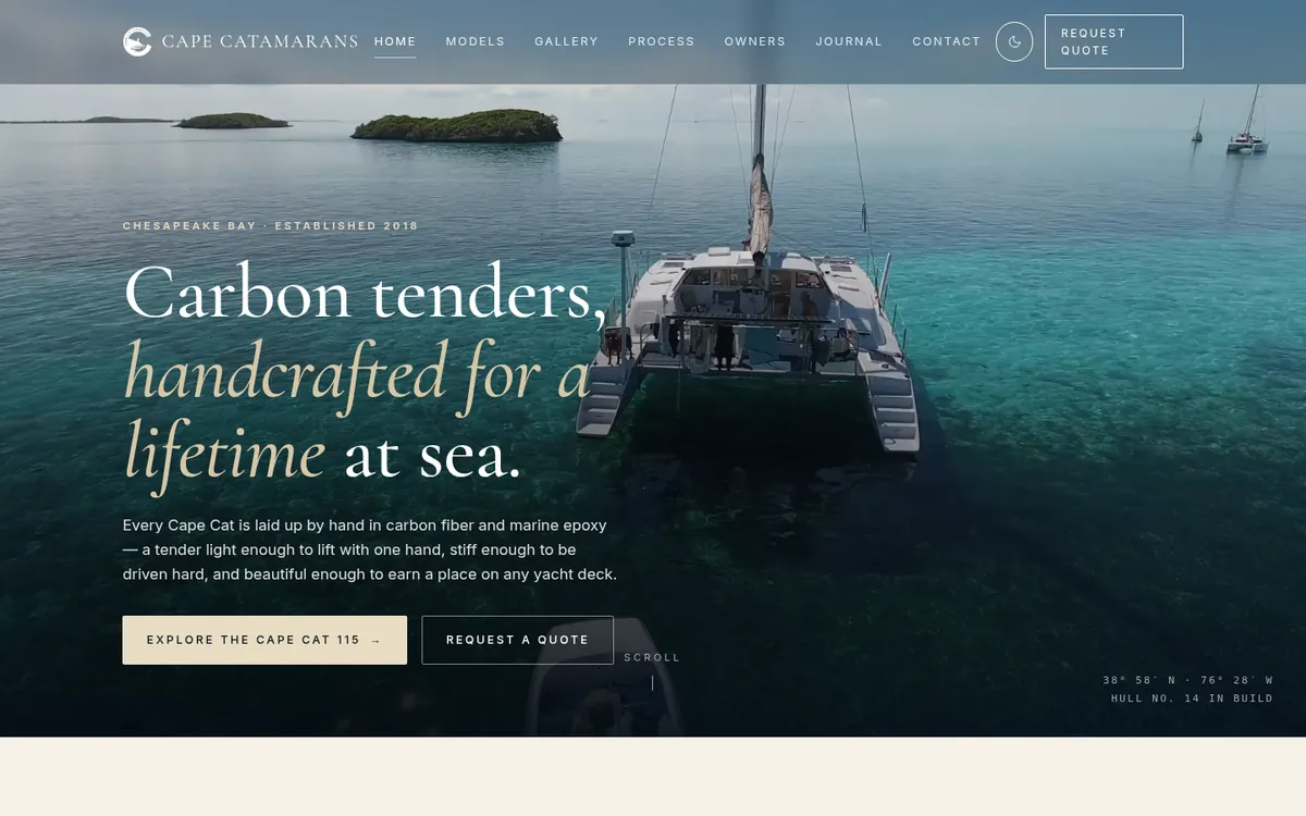
Designed, written, and built end-to-end. The home opens on a cinematic hero of the boat at speed, with build metadata visible immediately — Hull No. 14 in build — establishing craft specificity before any pitch language. From there the page moves through a four-chapter narrative: the build itself, materials chosen, configuration options for owners, and a small set of testimonials. Asymmetric layouts, deliberate hierarchy, and the close-up photography direction do most of the visual work.
Restraint is the editorial discipline here. No promotional language. No exclamation. The frame is set once and held: this is craft, this is technical rigor, this is a one-time purchase. The reader is trusted to draw the conclusion.
What shipped
Deliverables
- Cinematic hero with build metadata visible immediately — Hull No. 14 in build
- Four-chapter narrative: the build, the materials, the configuration, the ownership
- Original photography direction and a restrained typographic system
- Asymmetric layouts and deliberate hierarchy — close-up imagery does most of the visual work
- Designed, written, and built end-to-end as an independent design study
Highlights
- No promotional language, no exclamation — the editorial discipline is the point
- Restraint as the brand premise: this is craft, this is technical rigor, this is a one-time purchase
- Framed as a study, not a client engagement — design and copy are studio-original